
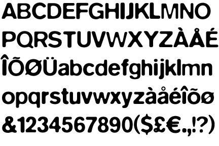
 One of the type faces created by Neville Brody.


1. Take into account the client, the company, the audience and the competition
When the message that is going to be conveyed is being elaborated, it is necessary to take account of the giver and the receiver of this message so as to ensure an efficient communication. Then, it is necessary to know what company is sending the message and adjust this message to the company characteristics. For this reason, to differentiate the company’s speech from their competition’s speech is another important aspect to consider. The receiver, or target audience, is important as well, and should be clearly delimitated, otherwise few people will get the message that is being sent.
2. Accomplish originality and differentiation
The selection of a specific esthetic among others should have a solid ground: the esthetic should solve certain communicational problems. To create a poster that stands out from the rest is of high importance. A poster should not be similar to another. If this occurs, the only result will be a confused audience and interference in the communication. The conceptual idea and the poster esthetic should be unique and recognizable among the visual pollution.
3. Accomplish compatibility between a product or service that is going to be advertised and the chosen esthetic.
It is necessary to find the most appropriate esthetic for the product or service that is going to be advertised, and the overall company. The chosen graphic concept should also be connected with the selected esthetic. For the audience to recognize the product presented, the design should follow certain structures. Regarding the graphic work, the designers will decide how much the classic and the innovative style will influence on the poster.
4. Establish hierarchies
Posters present different information hierarchies. For the client not to get confused these hierarchies must be clearly determined. The information must be arranged on the plane. To accomplish this and the proper communication of a message, the reading levels should be well defined the space available, exploited. We recommend avoiding information overload. Otherwise, the element you want to highlight in the poster will not stand out from the others.
5. Take an intelligent decision regarding the elements in the poster
The location of the different sections of information and the other elements that the poster comprises (text, miscellany, image) is very important. The effect and importance that the elements will have is directly connected to their position in the whole piece and in relation to the other elements.
6. Take an emotional decision
When designing a poster, the emotional impact it will have on the different individuals is an important element to consider. This element should be used to bring positive results and should be taken into account so as to avoid a counterproductive effect. A poster may not reach the personal perception of every individual, but it is possible for them to cover certain aspects that are directly related to a specific group. This is called segmentation. For example, colors: colors do not have the same effect on men and on women and this effect will also vary according to the different cultures.
7. Analyze colors and budget
Evaluate the amount of colors that will be used in the design, taking into consideration the message that is going to be conveyed and the available budget. Sometimes using four colors is very effective, but in some cases one or two colors may also have a great impact on the viewer. Designs that comprise one or two colors are cheaper, and so, more convenient.
8. Verify the poster possible applications
Before printing the whole posters print runs, we recommend testing one of them. Put it at an appropriate height and distance. Verify that the message is properly conveyed when the poster is exposed to the space conditions that the environment provides (light, fog, reflex, shades, obstructions, etc.)
9. Take account of the amount of posters and their use.
When deciding the design strategy that is going to be used, it is necessary to take account of the amount of posters that will be printed, the places where they will be exposed, the height at which they will be located, and the circulation. According to the possibilities available, mass-produced posters can be designed. They can be posted at a specific distance from one to the other and arranged in a certain way so as to generate expectations, intrigue and surprise.
TEXT FROM: WWW.POSTER-DESIGNERS.COM
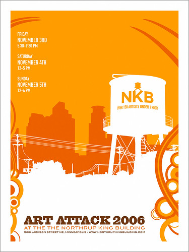

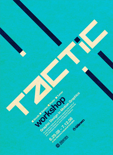
 examples of poster design focusing on the hierarchy of the text


Kerning – the lowdown:
Kerning is the space between letter pairs. When you set type in any pro-grade graphics program (like Photoshop, Fireworks, etc.), you have the ability to alter the space between letter pairs, making minute adjustments until your type looks just right.
What's that you say? "It looks fine without adjustments of the space between letter pairs?" Put down those pork rinds and pay close attention Cletus...I'm going to enlighten you.
Proper kerning is, in my opinion, the single biggest thing -- and the first thing I notice, that separates the work of professional designers from that of 'apprentice' or 'wanna-be' designers.
The amount of empty space between letter pairs 'wants' to be equal, and that's the goal of hand kerning your type. Your mind reads the words your eyes see. When there is visual and spatial continuity between all the objects (letters) it's easier to read, the better things look, and the more you can concentrate on the meaning of the words, rather than the minute 'visual hitches' that are created by poor kerning.
The fonts you use have information about spacing between letter pairs embedded in them normally. If they don't have that info, the graphics program handles the spacing between letter pairs. Sometimes the graphics program and the letter pair spacing data both fail you, and it's up to you to fix that.


A new graphic design style emerged in Switzerland in the 1950s that would become the predominant graphic style in the world by the '70s. Because of its strong reliance on typographic elements, the new style came to be known as the International Typographic Style.
The style was marked by: 1) the use of a mathematical grid to provide an overall orderly and unified structure; 2) sans serif typefaces (especially Helvetica, introduced in 1961) in a flush left and ragged right format; and 3) black and white photography in place of drawn illustration. The overall impression was simple and rational, tightly structured and serious, clear and objective, and harmonious.
The style was refined at two design schools in Switzerland, one in Basel led by Armin Hofmann and Emil Ruder, and the other in Zurich under the leadership of Joseph Muller-Brockmann. All had studied with Ernst Keller at the Zurich School of Design before WWII, where the principles of the Bauhaus and Jan Tschichold's New Typography were taught.


